Case Study
Brandi Henderson’s The Pantry, a beautiful, wood-crafted, book-bedecked kitchen & dinner space, was one of the first new businesses to call us on not just for branding, but for an absolutely one-of-its-kind e‑commerce platform. Heading out beyond where our maps could guide us, we created a lively, discursive brand underwritten with a website that became the model for event registration platforms around the country.

The Story of the Pantry
The Pantry brings together culinary passion (and talent) with an incredibly well-organized and aspirational business model to offer an astounding number of events, dinners, classes and more, nearly around the clock. And instead of marketing that business with an equally never-ending stream of keywords and social media ad buys, they put a premium on communicating (and inviting) substance, vision, and partnership. Nothing is faked, or phoned-in, as it would be by many of the businesses inspired by the Pantry; there were no calls to cut corners here, and so the brand itself, as much as the space, came down to what would actually feel great, what would ‘we’ want to see here, and what would resonate.

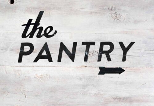
Can a sandwich board communicate more than simple wayfinding? If its handmade, hand-painted, and well-quirked, it might just suggest the substantive, palpable, heart‑y business behind it.
The gist of it
Every asset had a dual purpose: its primary function, and how it represented / advanced the business’s values. Business cards shouldn’t just deliver the details, but be as relatable and discursive as the employees. Photography should give us more than thumbnail images, buty be warm and resonant – let’s build entire stock collections of our own using Hasselblads and film. Print collateral as much as the website should have a playfulness and inherent, obvious delight to each piece. There should always be a reason, and an aspiration behind the reason.

Film photography by Our Lady Molly Wizenberg set us up with a suite of “stock” images for several years’ worth of business cards.
“Experience design” being about much more than where to put the buttons on a website and which colors signify actions? It can come down to making sure that the gift certificates that lead one to the sales platform establish a trust and curiosity in the business itself. That the next experience in line – the website, or the space itself – builds on it is only the next step.

Letterpress printed gift certificates have a Willy Wonka Golden Ticket-feel (literally) to them. They’re vaguely mysterious, while seeming like an actual treasure, and right there – before one has even cashed it in – they’re a fan of whatever this business is about.
The Website
What you have to understand about this website is that it both has to charm, immediately, but also be able to “sell” and process sales that, during a class release, amount to more than 700 interactions per second. It has to balance the founder’s minimalism with their preference for what is resonant and inimitable. It has to engender an actionable affinity, while definitely, definitely delivering on the actual sales, sneaking what would otherwise be a whole world of UX / UI decisions under the wire for the sake of an overall experience that values and protects your presumed loyalty.

Our Solution
The website itself became a metaphor for the space, opening with an early version of the same sandwich board we built and painted and which still stands on the corner before every night of events, and opening into embodiments of the space itself: An event schedule under the same rafters the dinner table sits beneath, and static pages that look in on the staff directly, all photos shot on the same film used for the business cards.

Multiple “product” photography shoots provided the website with a library of exchangeable, home-grown stock images that build on the tangible, warm feeling of print assets.

While in 2020 we might stay away from lightboxes, they allowed for easy in-and-out exploration of the catalogue, and delivered a fully custom / unique ticketing and waitlist cart.
Dissatisfied with either the functionality or the customization abilities of every off-the-shelf e‑commerce CMS out there, we built our own: Custom plug-ins and scripts power a website that can sort, track, and offer hundreds of space-limited events, simultaneously registering ticket buyers and waitlisted overflow. Explored “product” tiles update for availability in real-time, with timed interactions constantly informing others. How effectively? Sales enough to fund the entire business for the year are generated over just a few release days per year.

While perpetually in development – a new website in the works as you read this – and always being reconsidered for the sake of fun as much as refinement, the Pantry’s brand has been one of the most rewarding campaigns we’ve worked on, and primarily for that very reason: it never stops considering how it might better and more effectively connect, and engage, its people, and never loses its distaste for what is cheap and shallow. And from the start, we’ve been there consulting on the space, directing photography that makes you want to move in, and thinking up solutions that, where they would otherwise be tedious, simply make you giddy, or smile a little at the edge of your mouth. It’s a brand that wonders if you’re their kind of people, just as its hoping you’ll see that it is one of yours, and there’s no more fun challenge to work on.
Visit:
Services:
Logo Design, Website Design, E-Commerce, Positioning, Photography