Case Study
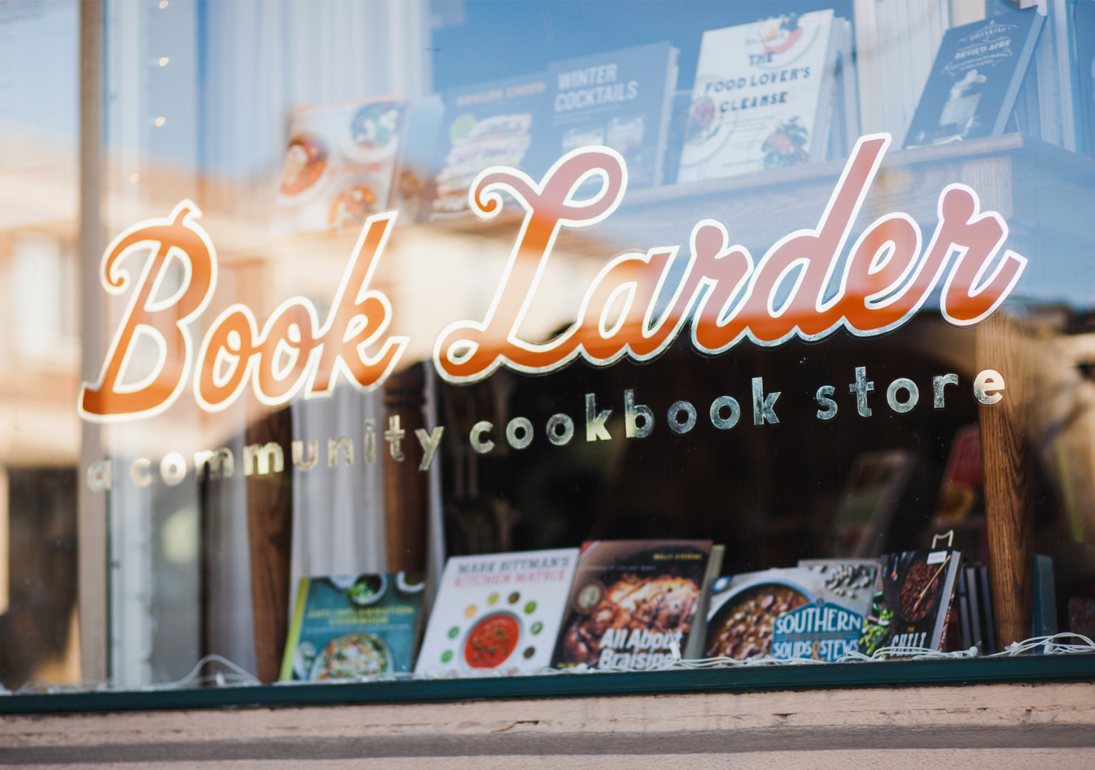
Book Larder’s identity was designed (literally) to be so damn charming you’d more think it was out of a movie than your own neighborhood: every single asset designed to get the absolute most out of the opportunity to engage and delight, from its one-of-a-kind digital platform to its endlessly considered bookmarks to one of the most photographed bookstore-fronts around.


The Website, Ver. 1
The first generation of Book Larder’s website seemed itself torn from the pages of a cookbook: Calls-to-Action were ingredients, the descriptions of the business were instructions on how to go about building the experience you wanted / needed. At the same time, in addition to one of the first fully custom event-registration Content Management Systems, we designed for Book Larder a sales platform for titles that almost no independent bookstore can claim. Later versions of the website would continue to improve on both the function and aesthetic quality of each of these functions.

The circa 2011 cookbook-style website made an experience of the user’s exploration.

Circa 2013, the website expanded its full-catalogue offerings with extensive filter controls, coupon options, and searchability.
Add UX Mockups
As the business and its brand have grown up, we’ve been tasked with bringing the website (and design system) along, refining its asset libraries and relationships, and expanding on its capabilities. Heading into 2020, we’re looking at a custom off-canvas cart and payment gateway that will allow the user to venture all the way through a sale without getting lost in navigation or so much as leaving the page. The logic of the cart can now recognize the checkout needs (different information is needed from one shipping a book than one registering for an event), and efficiently collect only the necessary information for each particular sale.

The off-canvas cart is as well-customized and configured for continued shopping as for efficient, painless checkout.
Why we’re in love (with the Book Larder brand)
The brand’s own system, no less identity, never stops growing, evolving, and adjusting to either its changing needs or to new opportunities. As the product lines have expanded, the brand’s voice was allowed to keep pace and make each new line seem foundational. At the same time, the owner has always valued the digital experience as much as the physical assets, encouraging multiple re-thinks and updates to the platform both for aesthetic and functionality.

Visit:
Services:
Logo Design, Website Design, E-Commerce, Positioning, Identity