Case Study
The Hawaiian Vanilla Company is a one-of-its-kind, family-owned operation that joins Old World, passed-down botany with a forward-thinking scientific approach. It’s also one of just a handful of vanilla growers in the world cultivating, harvesting, and selling its own vanilla, and the only in the United States.

Photo shoots in the rainforests of Hawai’i Island are not the least pleasant.

There are worse commutes to work than coming up these mauka roads in the morning.
We were tasked to help HVC tell their story, both in concept and through visual expression. This included everything from brand design, to packaging, photography, and building a wholly custom platform for direct sales of their 65+ products.

While having all the capabilities+ of our most advanced e‑commerce platforms, HVC’s site was designed as more of a storybook than a brute sales channel.
The Concept
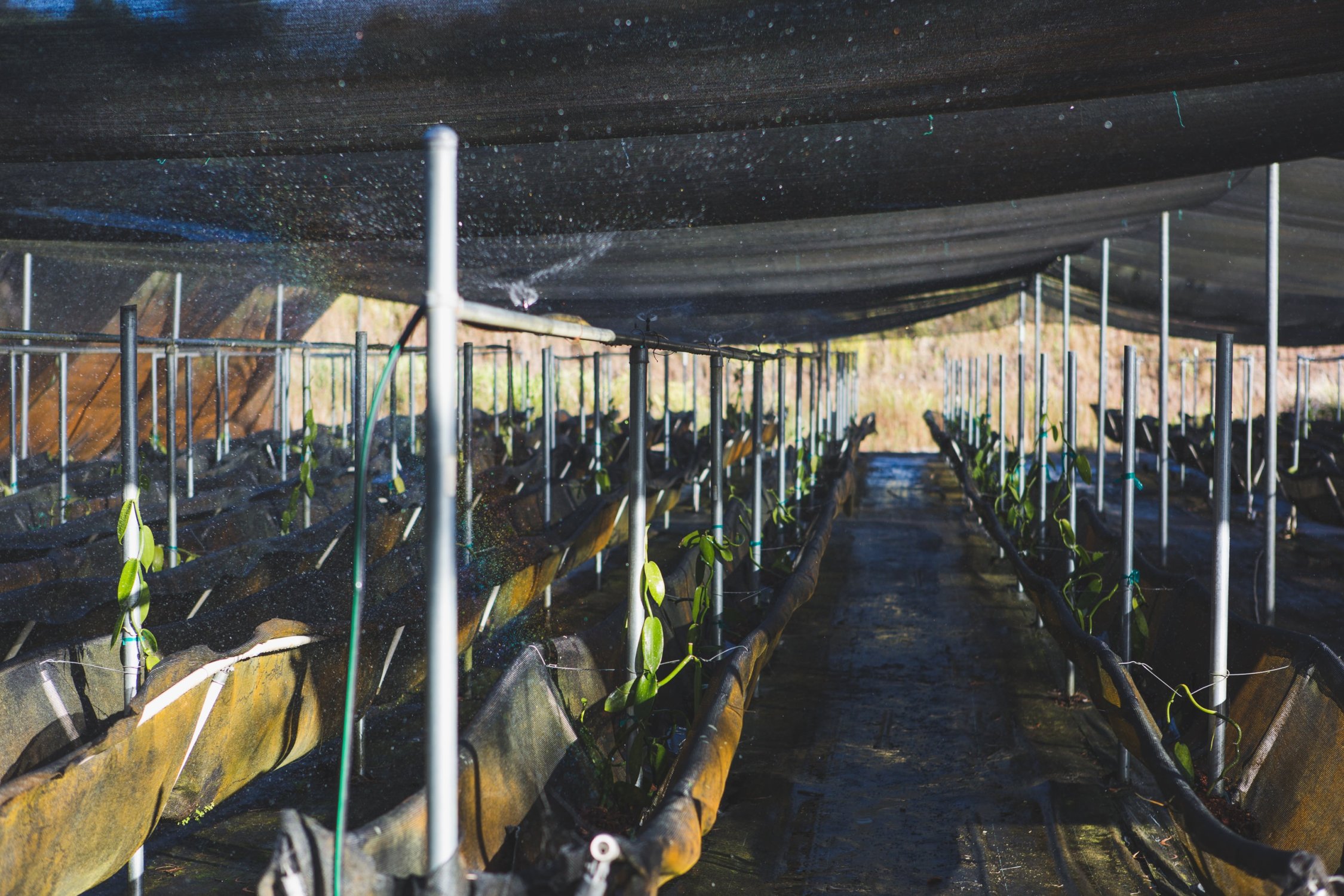
The Hawaiian Vanilla Co. was founded on Jim Reddekopp’s passion for cultivating orchids, working with the most venerated master growers in Hawai’i, but the business he and his family built had no precedent: not only was it the first (and to this day the only) vanilla operation in the United States, it required ingenious adaptations to growing techniques that have made the company’s growing shacks a source of study for agricultural and botanical schools around the world.
We knew the brand had to represent his spirit and approach, as he cultivates natural, organic, and advanced crops, balancing hard-earned craft and meticulously refined innovation. We worked toward an identity that felt organic to the living history of the region, and which embodied the great wealth of Story that joined the family to its craft to the industry.

Family owned, family run, family loved

6 different photo shoots, by 3 different photographers, over 4 different visits (and counting)
We took inspiration from the historic businesses of the Hāmākua Coast, from the signage over trading houses in Honokaʻa to the sugar mills of Paʻauilo, visiting, photographing, interviewing and meeting with the family and community.

Neversink’s Pa’auilo 3 typeface
As we developed the identity, we were unable to find a typeface that was both a nod to history and an adaptable, legible, scalable look that would carry a consistent voice across media. We might find a font that was good for display and materials, but not UI, or screen-optimized web-fonts that lacked the character and scalability for print.
Paʻauilo, our typeface which carries the name of the town in which both it and the vanilla were grown, was developed as a multiple weight, multiple font family that we ourselves optimized for print and web, ensuring that very consistency in their visual language that we felt was paramount to telling their story.

Neversink’s Pa’auilo 3 is the foundation for more than 60 skus and 20(?) product lines now, a powerful display face that has as much legibility as it has character.

We started by creating a logo and collateral system based on an exaggerated grid system — something that felt both scientific and artful. And then we pulled that system into the packaging design.


And that carried over into merch. And collateral. From catalogues to a custom e‑commerce platform, all of the brand touch points matter. There is a throughline because there is a foundational personality underlying the brand, a system established by and for the very soul of the company.
The Platform
Our website for the Hawaiian Vanilla Company had to tell – to evoke – their story, and the very fact that their is a story behind them, as well as it had to facilitate sales, allowing them a direct relationship with an international customer base. While their 60+ skus are stocked on shelves around the world, their greatest opportunity is in the market populated by their loyal fans, and new eyes drawn to their brand.

Family portraits, environmental galleries, and more than 1,000 photos of the facilities tell an evocative and persuasive backstory to the products.

Multiple rounds of (ongoing) product photography themselves stock the e‑store, with related products, and a filterable catalogue allowing for an intuitive search of the entire product line.

The website, at every step, offers a parallel journey to that of learning HVC’s story – and that of its products – with a retail journey given multiple points of entry.

Solution
While there are always checkboxes to check – the need for some identity assets for the sake of stationery, packaging; a web presence and sales platform – the ‘solution’ to the greater question of how to relaunch such a spirited, passion-led brand in an incredibly complex international market came down to protecting and championing its earnestness. Every last employee approaches their work with heart, and hopes for much more in their sales than simply moving product. For the experience of the brand, then, we were similarly aspirational, wanting the for each product an equally discursive and delightful relationship.